Sydney University Law Society
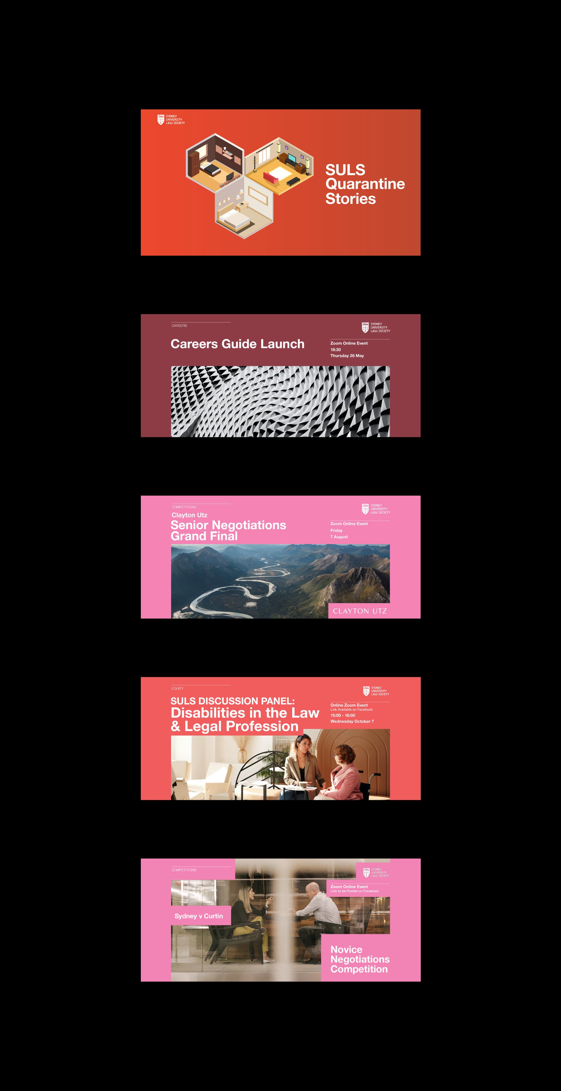
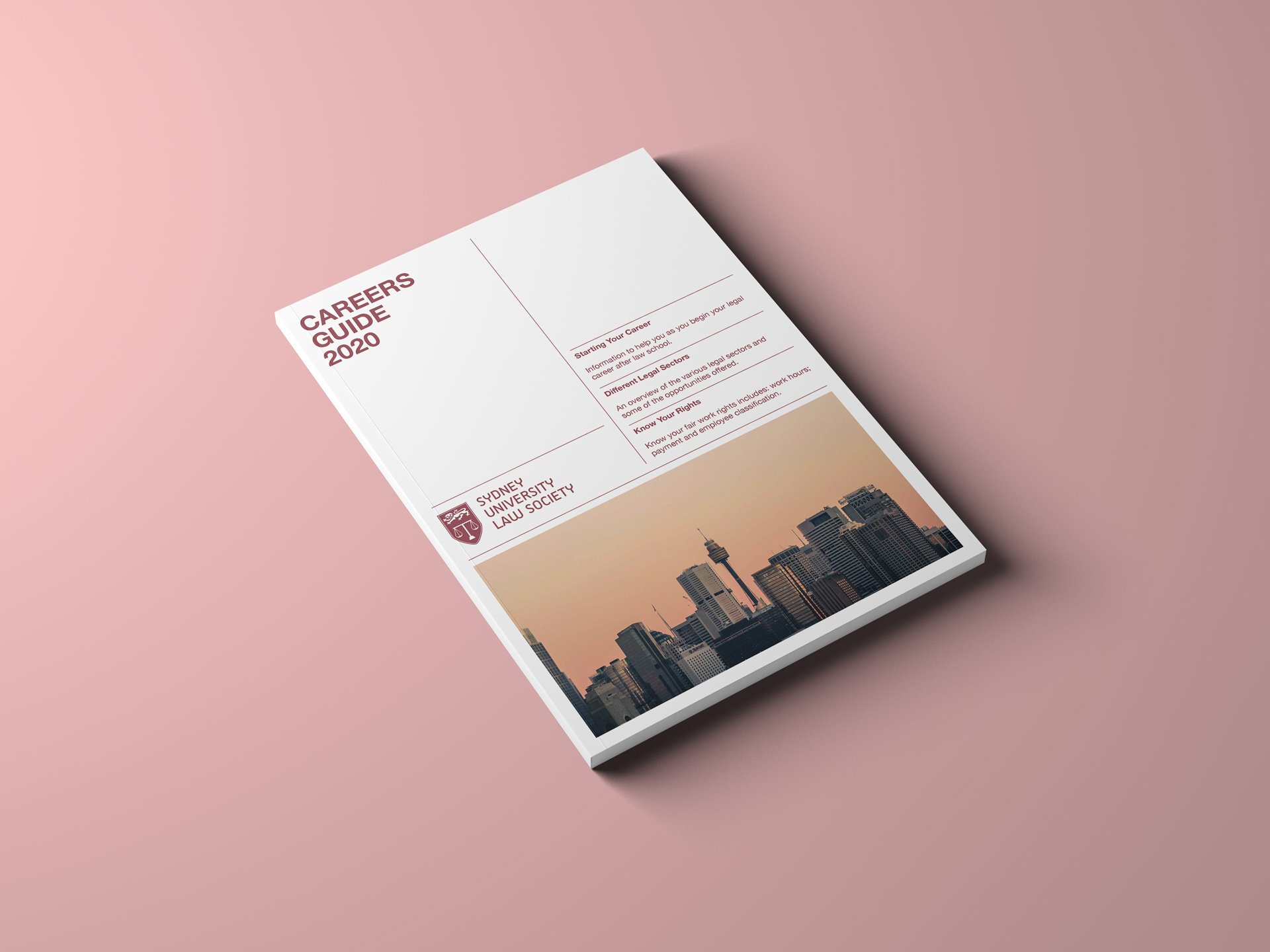
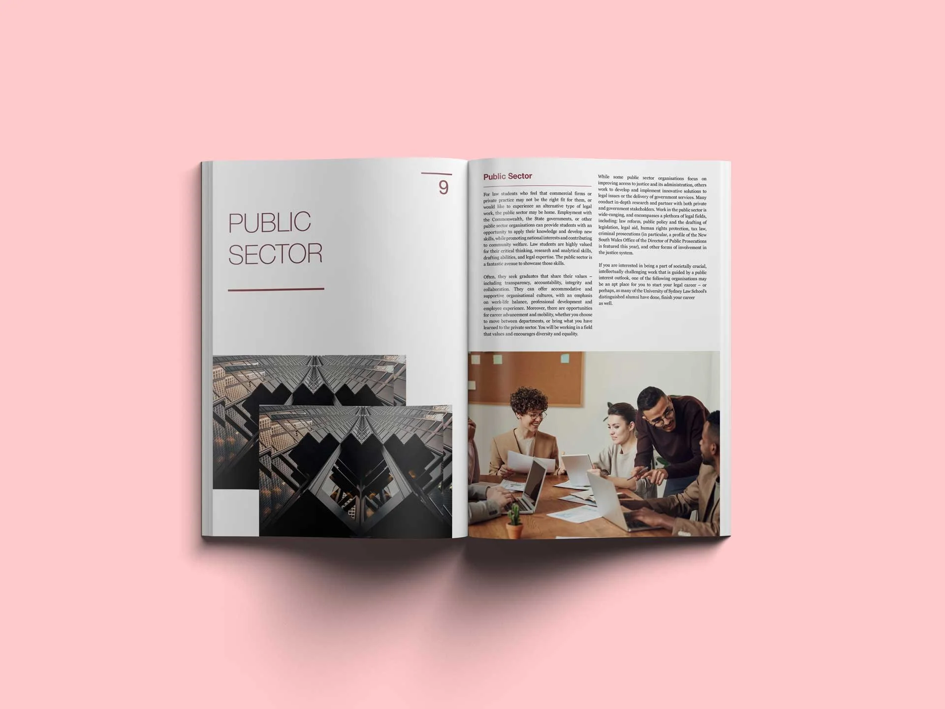
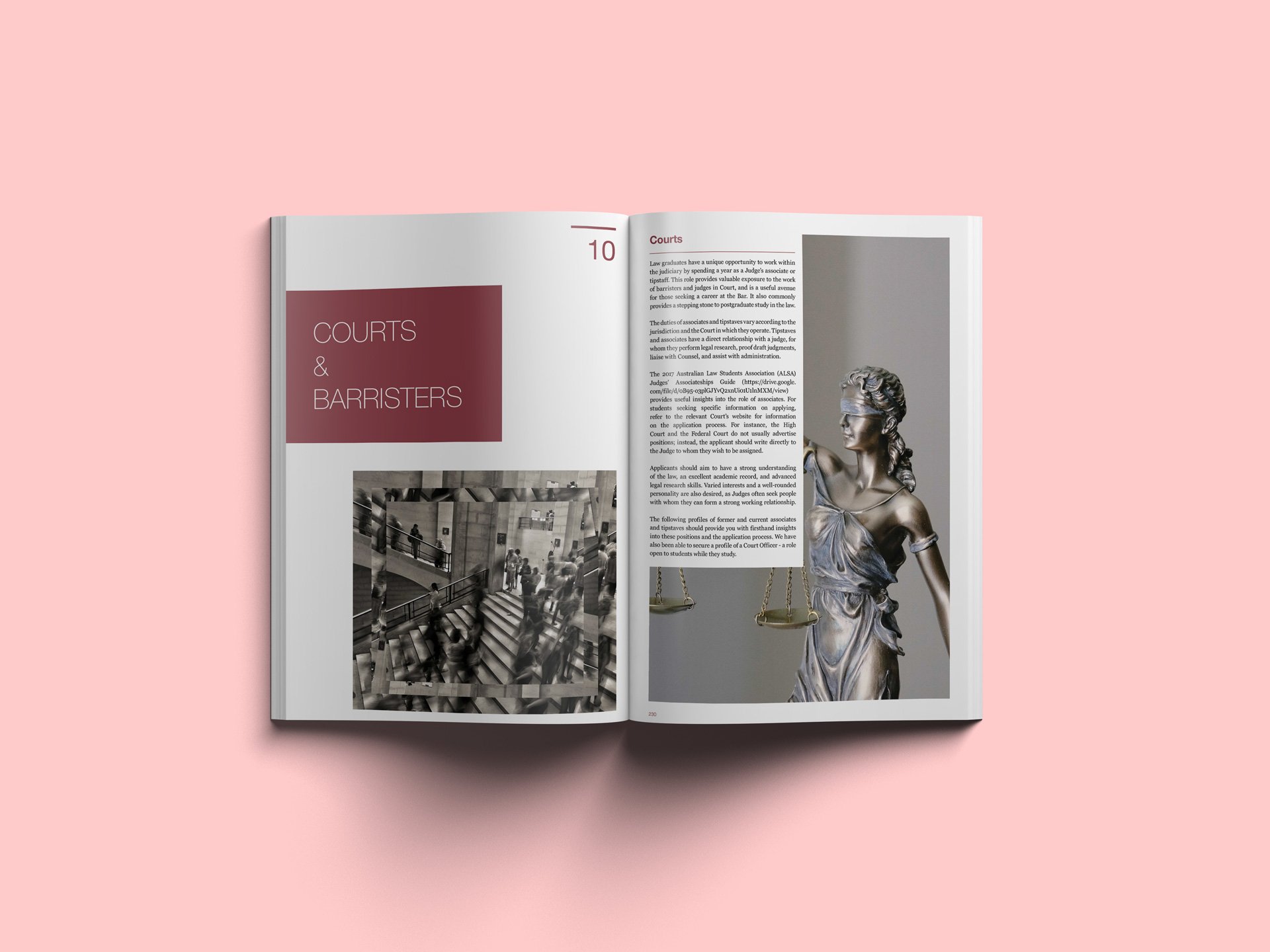
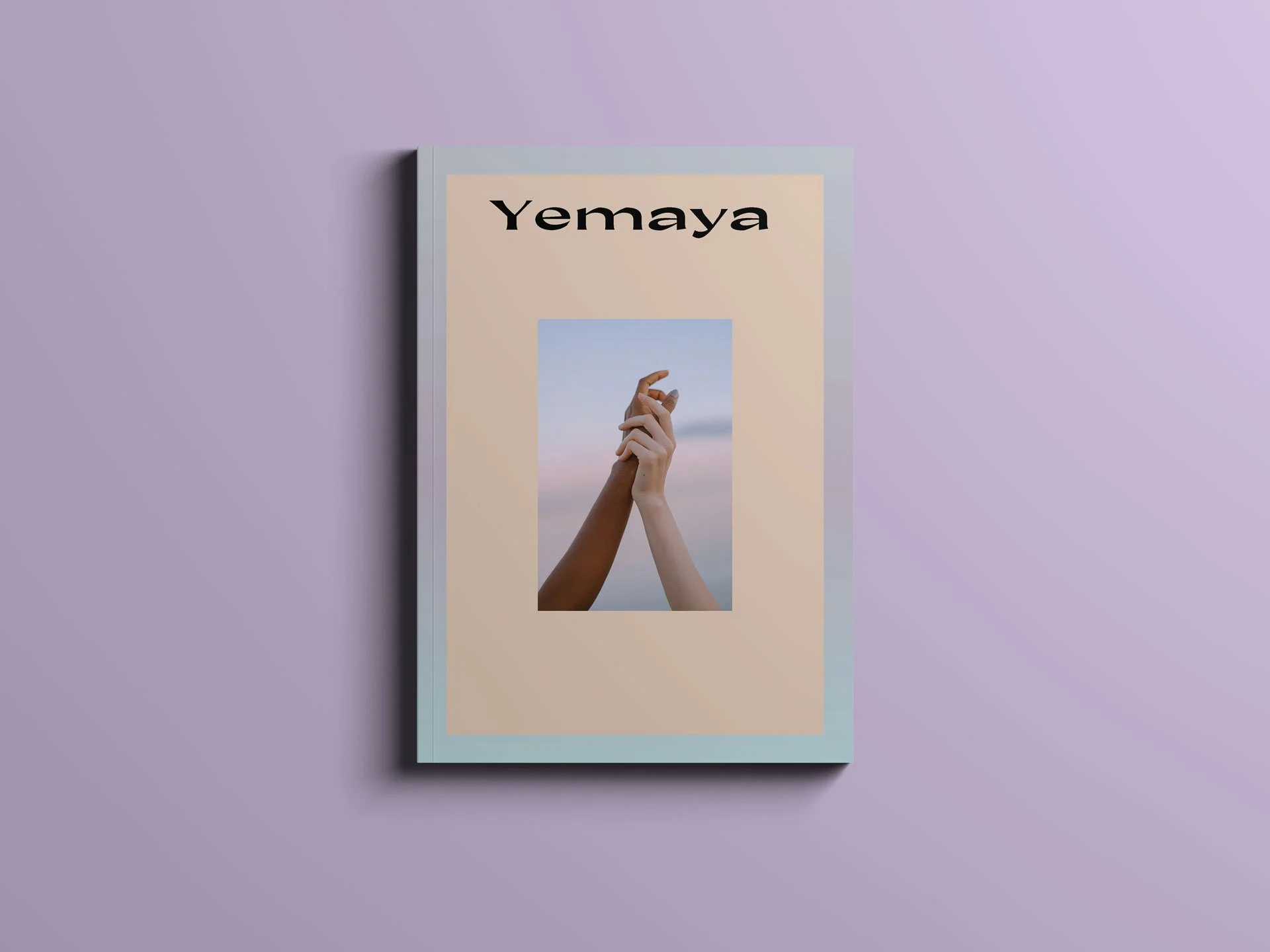
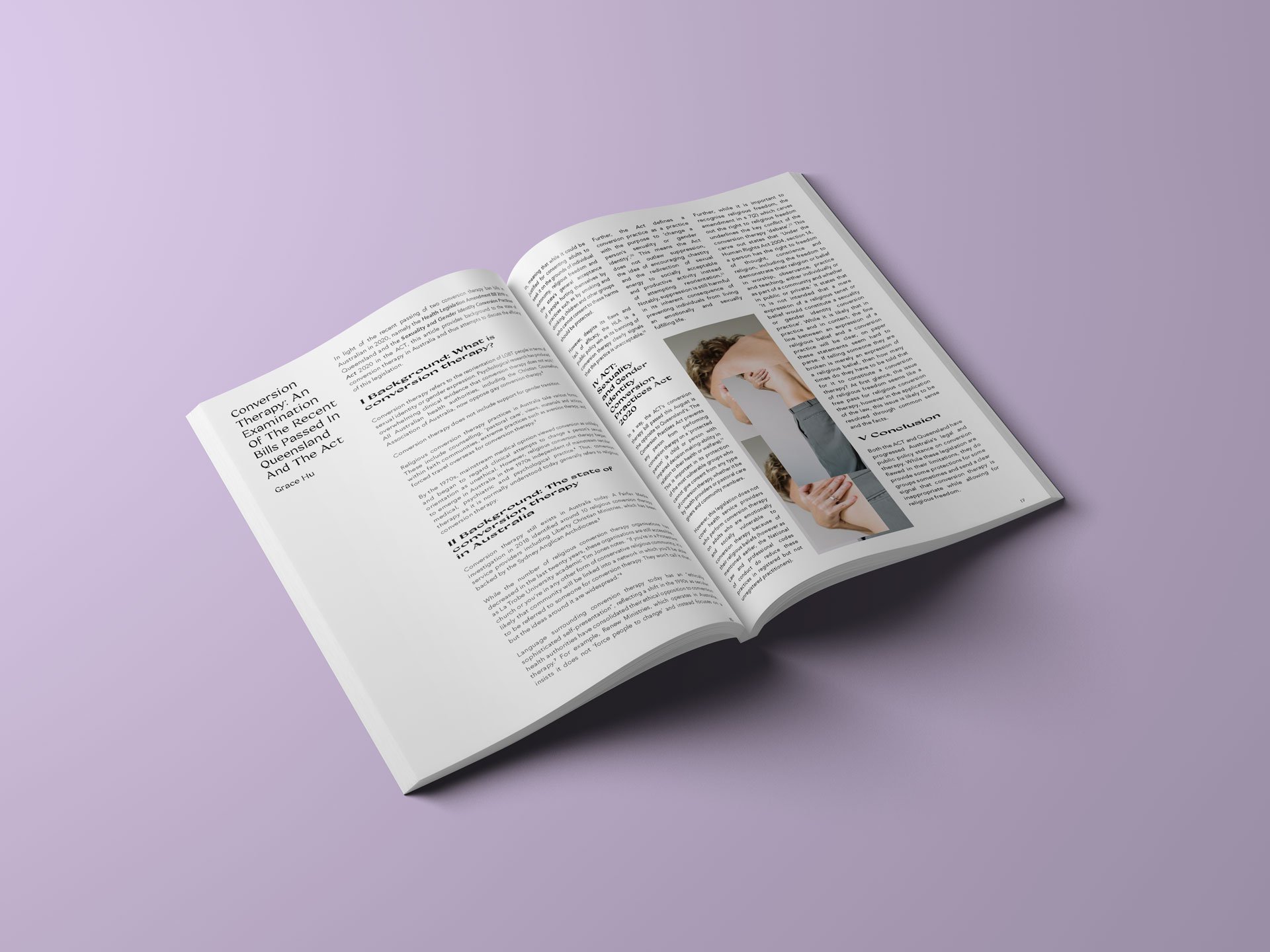
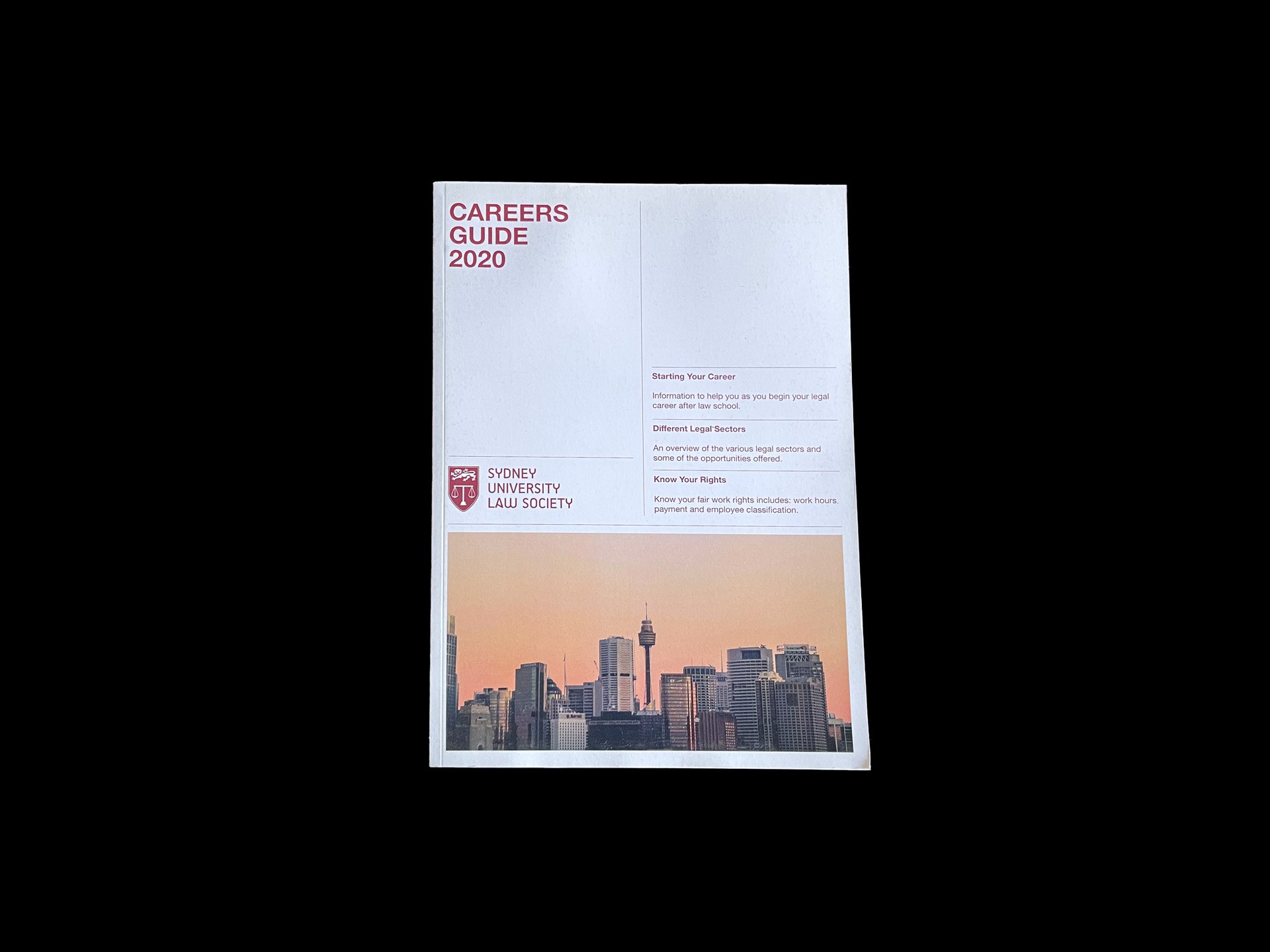
As Design Director of SULS, I was responsible for directing a team of designers as well as designing a variety of assets. These designs included publications, and social media assets such as posts, ads, and videos. During my tenure, we developed a robust visual language that was cohesive across all media and allowed for a stronger brand presence. This was recognised in our Careers Guide publication that was awarded ‘Best Careers Publication’ of 2020 by the Australian Law Students’ Association.
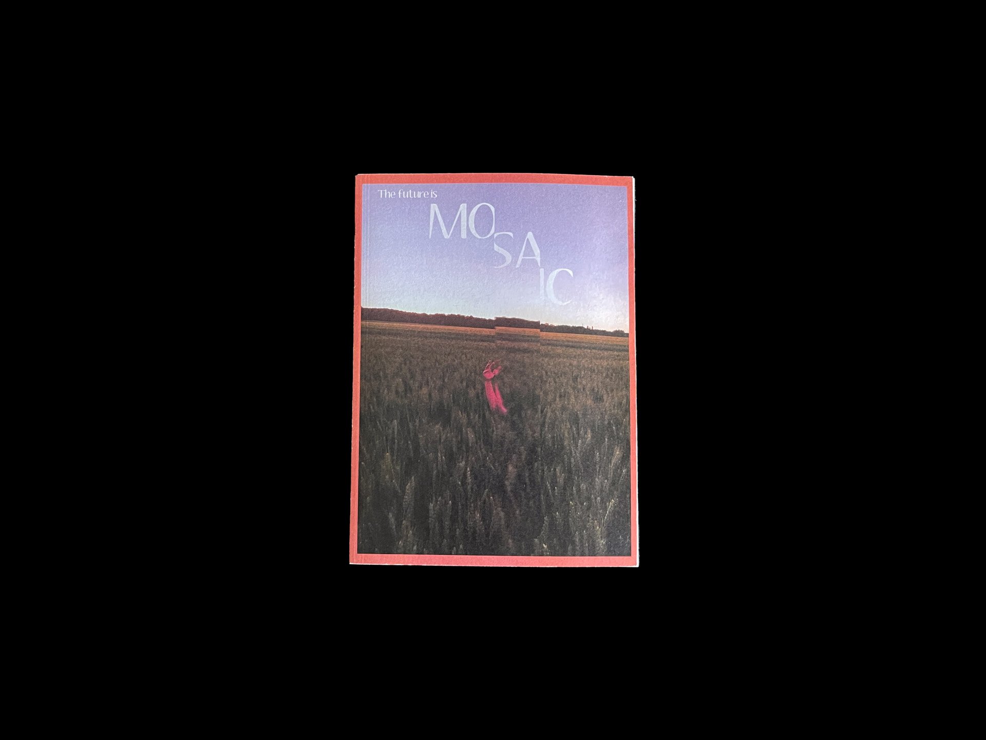


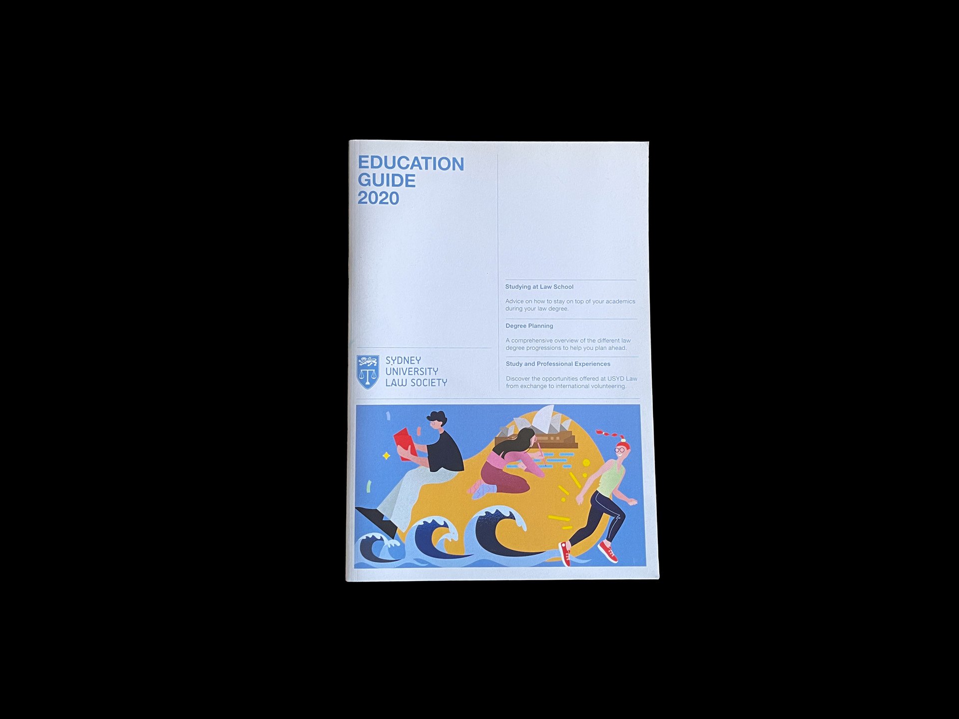
To retain cohesion across the numerous portfolios in SULS each one was given a specific colour to be used across all assets. This was just one of the details included in the brand guideline that was developed for SULS.
Given the number of assets that needed to be produced, templates were also designed for all assets. This way there could be a robust and identifiable visual language further cementing SULS’s brand.
